Client: GIEN (Pune, India) Industry: Startup Incubation / Global Networking
Project Overview
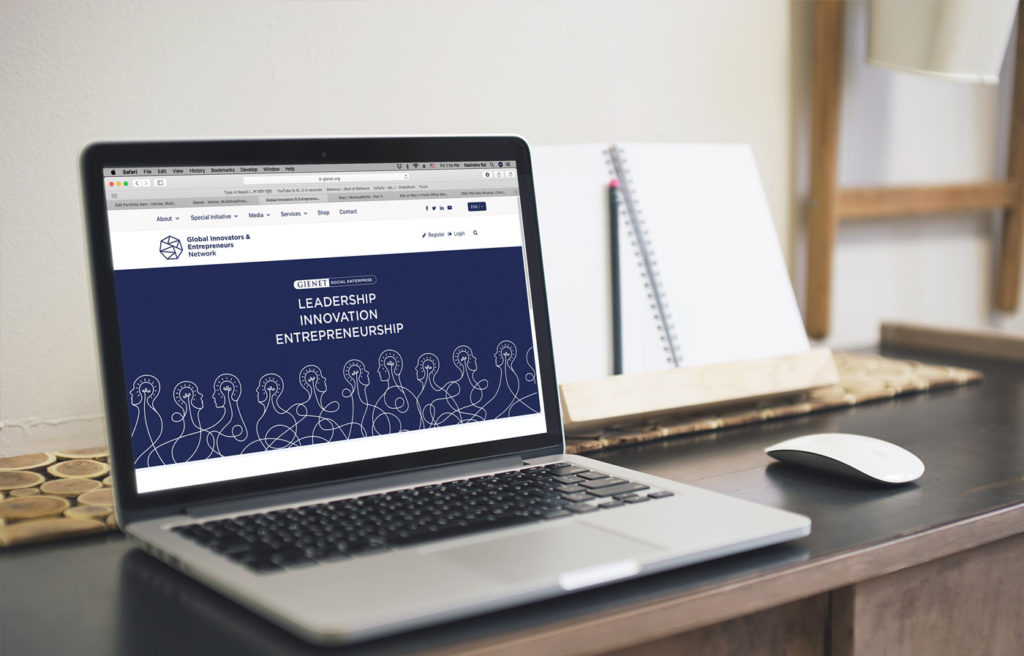
GIENET connects innovators, entrepreneurs, and investors worldwide through its Pune-based incubation hub. The brand identity needed to reflect collaboration, innovation, and global reach, with a focus on flexibility for event branding.

Key Deliverables
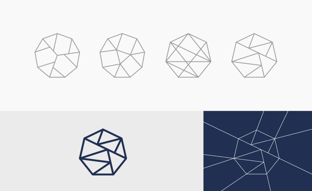
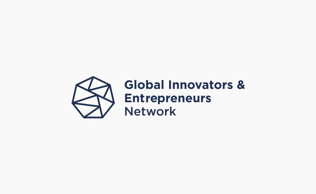
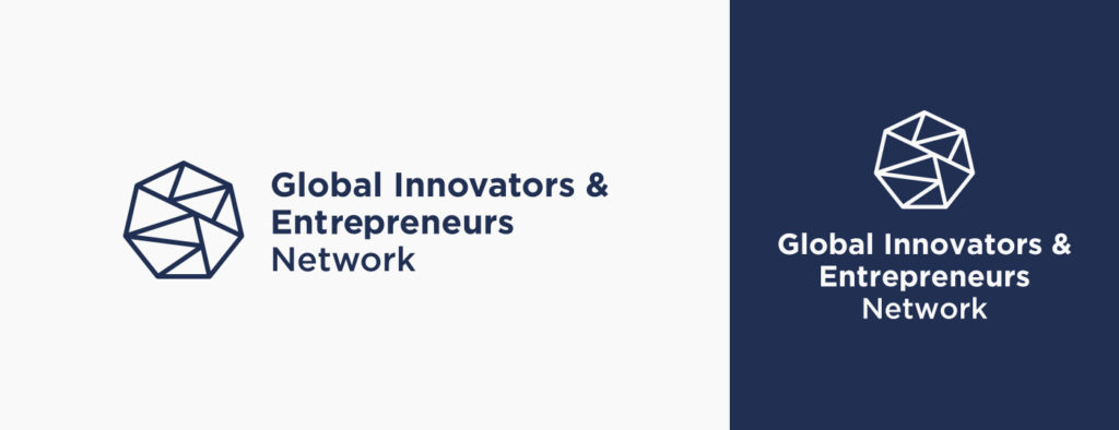
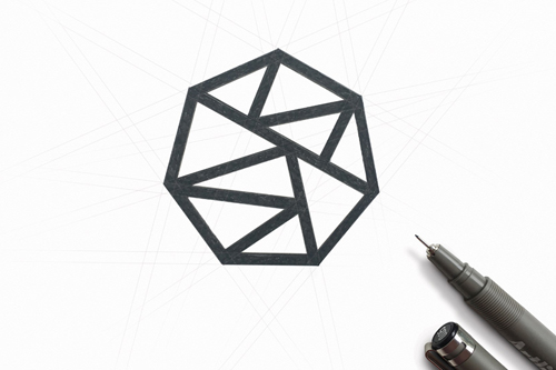
- Logo Design: A geometric, interconnected hexagon symbolizing networks, stability, and growth, paired with clean typography for a modern, professional look.
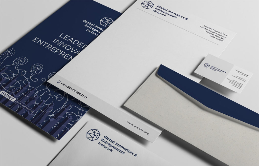
- Brand Identity: A vibrant color palette (blues, teals, and energetic accents) and modular visual language to convey dynamism and connectivity.
- Event Branding: Adaptable designs for summits, pitch events, and networking sessions, ensuring consistency while allowing unique event themes.
Design Approach
- Logo: The hexagon’s interconnected lines represent partnerships and global connections, aligning with GIEN’s mission.
- Visual Language: Bold typography, abstract patterns, and custom illustrations to emphasize innovation and diversity.
- Event Collateral: Modular templates for invitations, stage backdrops, and digital assets, ensuring cohesive yet distinct event branding.
Outcome
A versatile, globally appealing identity that positions GIEN as a hub for innovation, fostering connections between entrepreneurs and investors. The design supports their goal of building a thriving startup ecosystem.
