Client: Leafsip (Darjeeling, India) Industry: Organic Tea / Sustainable Beverages Scope: Brand Identity, Logo Design, Packaging Design, Market Listing Assets
Project Overview
Leafsip is a Darjeeling-based startup dedicated to delivering 100% natural, fresh tea with no artificial ingredientsand eco-friendly packaging. Their brand celebrates authenticity, sustainability, and the art of tea, aiming to connect tea lovers with the purity of Darjeeling’s tea heritage.
The project involved creating a holistic brand identity, including a symbolic logo, packaging, and market-ready assets, to reflect Leafsip’s commitment to nature, wellness, and sustainability.


Key Deliverables
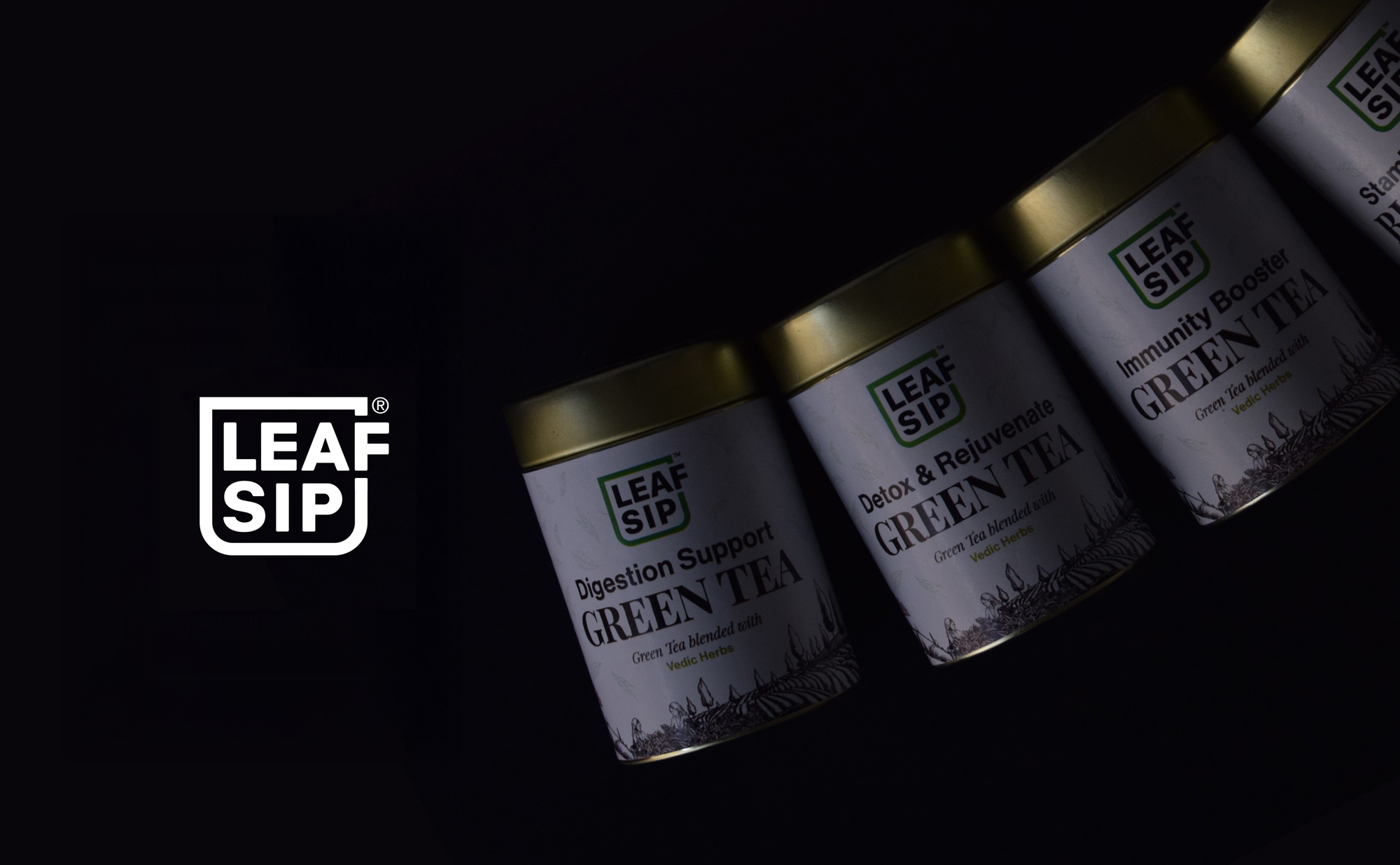
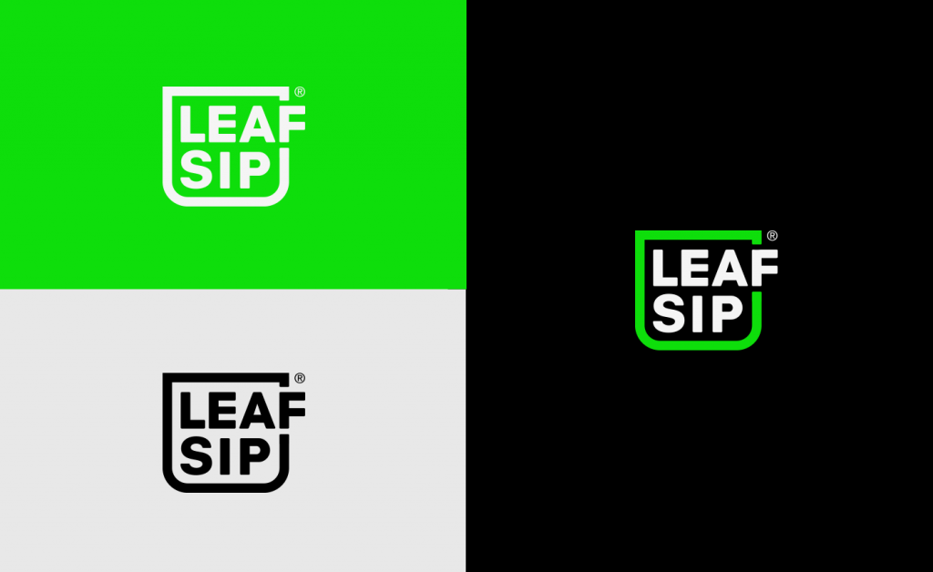
- Logo Design: A modern logo featuring a stylized tea cup, symbolizing warmth, tradition, and the ritual of tea drinking, while maintaining a clean and contemporary aesthetic.
- Brand Identity Guidelines: A comprehensive guide covering color palettes, typography, imagery, and design principles to ensure consistency and reinforce brand values.
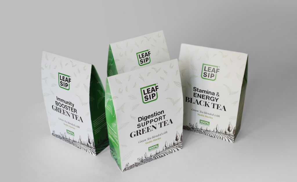
- Packaging Design: Eco-conscious, visually appealing packaging that highlights the tea’s natural origins and Leafsip’s commitment to sustainability.
- Market Listing Assets: Custom designs for e-commerce, social media, and promotional materials, ensuring the brand stands out in competitive marketplaces.
Design Approach
- Logo Concept:
- A minimalist tea cup icon integrated with the brand name, evoking comfort, tradition, and purity.
- Bold, rounded typography for approachability, paired with the tea cup symbol to create a memorable and inviting visual identity.
- Color Palette:
- Earthy greens and soft browns to represent nature, freshness, and sustainability.
- Warm neutrals and subtle accents to add depth and evoke the richness of tea.
- Typography:
- Clean, modern sans-serif fonts for readability and a contemporary feel.
- Organic, rounded letterforms to complement the tea cup symbol and enhance the brand’s friendly and authentic tone.
- Packaging Design:
- Minimalist, eco-friendly materials (e.g., recyclable or compostable) to align with Leafsip’s sustainability mission.
- Illustrations of tea leaves or Darjeeling landscapes to emphasize the tea’s origin and natural quality.
- Functional elements like resealable designs to preserve freshness and convenience.
- Market Listing Assets:
- High-quality product photography showcasing the tea’s natural beauty and packaging.
- Social media templates and e-commerce banners that highlight Leafsip’s story, sustainability, and unique selling points.
Outcome
A cohesive and nature-inspired brand identity that positions Leafsip as a trusted name in organic tea. The design successfully captures the essence of Darjeeling’s tea heritage while appealing to eco-conscious consumers, supporting Leafsip’s mission to deliver fresh, sustainable, and artisanal tea experiences. The symbolic tea cup logo adds a layer of warmth and tradition, making the brand instantly recognizable and relatable.